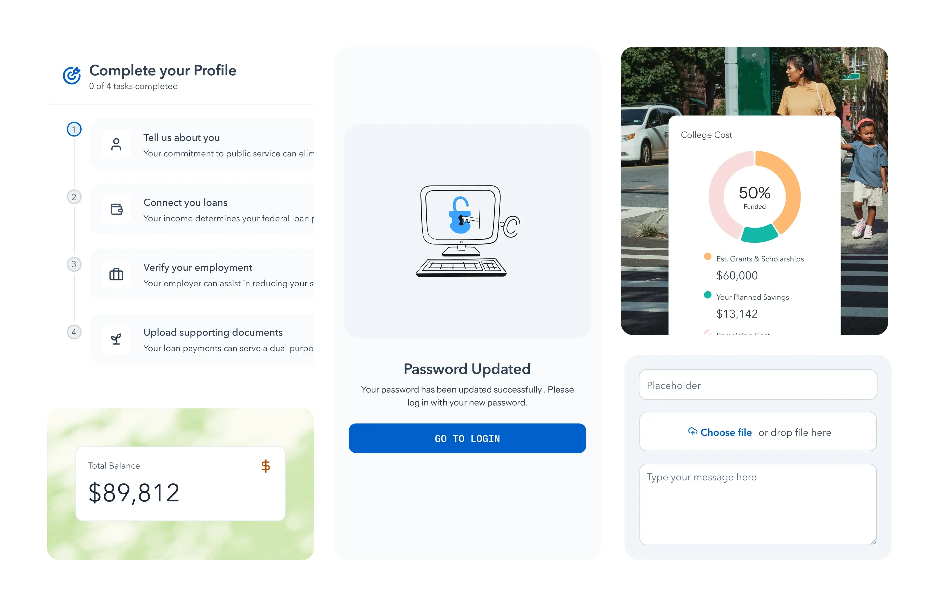
Mosaic: an accessibility-first design system
Summer · Senior Product Designer · 2025–
- Scope
- Tokens, components, patterns, Figma and Storybook, migration sequence
- Team
- Me, with the platform and product engineering teams
- Status
- Live; migration in progress, flow by flow
Outcomes
- NYC
- largest municipal program of its kind
- 3
- product teams ship on it
- WCAG 2.2 AA
- the standard, built into the parts
- 1
- designer
Information
A few things worth knowing before the story, if Summer and design systems are new to you.
- Summer is
- a benefit that employers, cities and states offer their people to help with student debt. An employee logs in to find the cheapest repayment plan, check whether their loans qualify for forgiveness, and get the paperwork done. Borrowers on Summer are projected to save over $2.2 billion.
- Mosaic is
- Summer’s design system: the shared kit of colours, type, spacing and components that every screen is built from, kept in Figma and in code so that design and engineering are working from the same parts.
- Accessibility is
- whether a product works for everyone, including people who use a screen reader, navigate by keyboard, or need stronger contrast. WCAG is the standard that defines it; Section 508 is the US law that makes it a requirement for public bodies and their vendors.
- A design token is
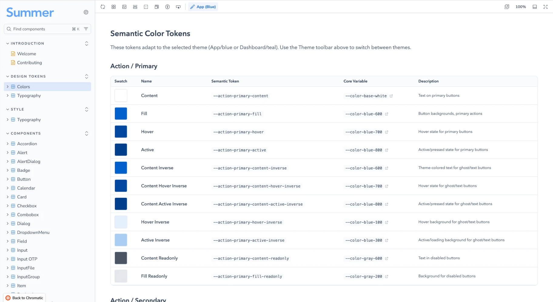
- a named value such as “action colour” or “body text size” that the whole product references instead of a raw number. Change the token once and every screen follows.
Why accessibility matters here
Imagine you are a nurse in a city hospital, a few years into your career, with student loans you have never quite understood. Your employer offers Summer. You open it on your phone on a break, and whether you finish depends on whether every screen works for you: readable, tappable, navigable by keyboard or screen reader if that is how you browse.
For the people Summer serves, the stakes are not abstract. A form that cannot be completed is a repayment plan not switched, a forgiveness application not filed, money left on the table by someone who could least afford it. For a city or a state, an inaccessible benefit is a legal exposure and a broken promise to its own workforce.
This is why the law caught up. From April 2026 a new accessibility obligation applies to US city and state digital services, and to the vendors that build them. Public bodies now write the standard into their contracts, so a product that cannot show conformance does not get to the table. Summer’s growth path runs straight through those contracts.
The problem
Summer had grown quickly with one designer, and it showed in the parts. Screens were built one at a time rather than from a shared kit, accessibility problems had built up quietly, and the honest answer to "is it accessible?" was "mostly, in places". Then a deadline and a rebrand arrived at once.
A single change meant fixing it in many places, and components were often used for the wrong job. The accessibility debt was specific: colours without enough contrast, controls with no name for a screen reader, focus states you could not see, keyboard paths that dead-ended, an error colour that did not pass. Teams kept adding screens to the old system knowing they would have to rebuild them later.
New York City was first in line on the April 2026 obligation. At the same time Summer’s marketing team was preparing a rebrand, and the old product could not take a new look without turning into a patchwork. One designer, one deadline, and a product that needed new bones. That is where Mosaic began.
Approach
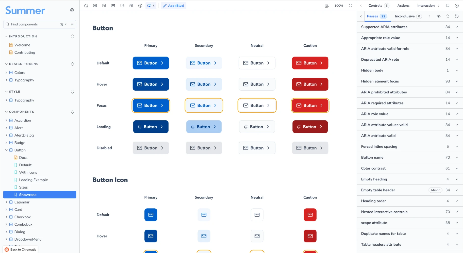
Build the standard into the parts, not the review. Semantic tokens by role, components with their states and focus behaviour decided once, documented in Figma and Storybook with automated contrast and accessibility checks on every component.
Mosaic started in May 2025 on an open-source primitive layer with a two-layer token architecture: primitive values underneath, semantic roles on top. Product code references roles only, never a raw colour, so a surface cannot drift below AA by accident and a theme can change in one place. Components carry their states, keyboard behaviour, focus order and accessible names, with distinct size variants for borrower-facing mobile flows and data-dense dashboards.
I evaluated the candidate systems, scoped the first library, set the handoff conventions (ready versus in-progress components, code-connected Figma, design walkthroughs, a staging review before release) and wrote the accessibility specification each component has to meet. The platform team stewards the infrastructure and tooling; product teams add components as features need them. Design and engineering now share one vocabulary: tokens by role, component decisions, and release phases.
Pragmatism got us through the deadline. Where moving a flow to Mosaic cost about the same as a token fix, we moved it. Where a full refactor carried regression risk, we swapped in semantic tokens and scheduled the refactor. By April 2026 the critical components were about seventy percent complete, and adopting the system on onboarding, savings and settings was expected to clear more than half of the open accessibility tickets.
Migrating a live product
Hundreds of files sat on the legacy layer. We migrate flow by flow behind release flags, with AI drafting the work from a designer-approved plan and people gating every step.
The first automated attempt sliced the work by component and produced lost context and duplicated pieces. The fix was structural: vertical slices, one page or flow at a time, shared primitives first, and every claim in a ticket verified against the codebase before handoff. Each flow gets a component map (what exists, what to compose, what to build, what to drop) and a colour map by role, approved by design before any code is drafted.
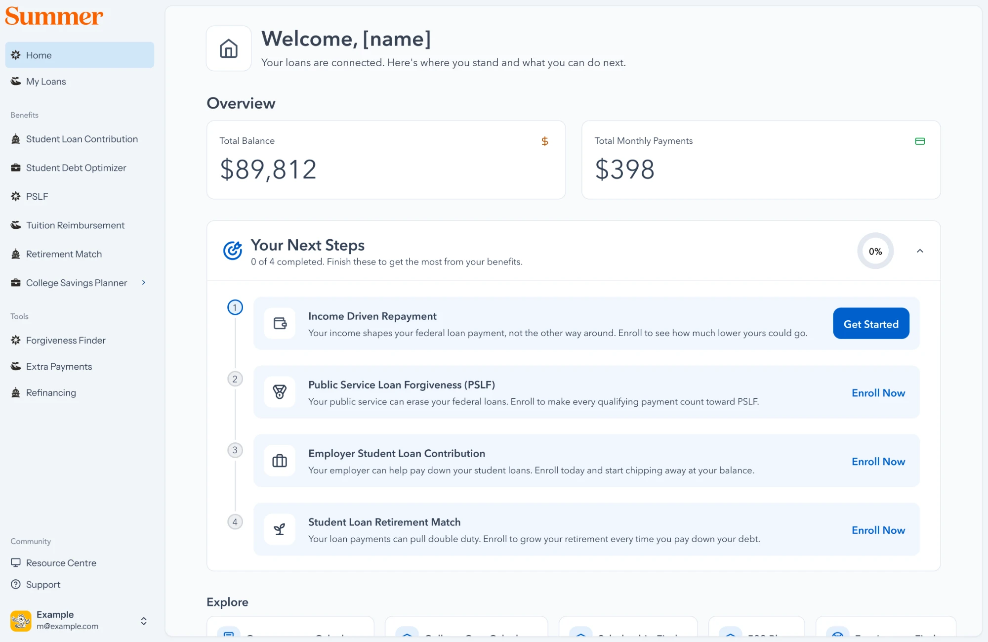
An AI agent drafts the migration from that plan; engineers review, and a release flag lets each flow ship when it is ready and roll back if it is not. Authentication went first, then onboarding. My Student Loans was the first complete journey rebuilt entirely on Mosaic, which means every screen in it meets the standard. New features since early 2026 specify Mosaic for all user-facing UI, so the accessible share of the product grows with every release rather than only through migration.
In 2026 Summer's marketing rebrand introduced a new palette. Re-theming Mosaic for it is underway, and the role-based tokens are what make that possible without touching product code. The contrast questions that work raised deserve their own write-up once the theme ships.
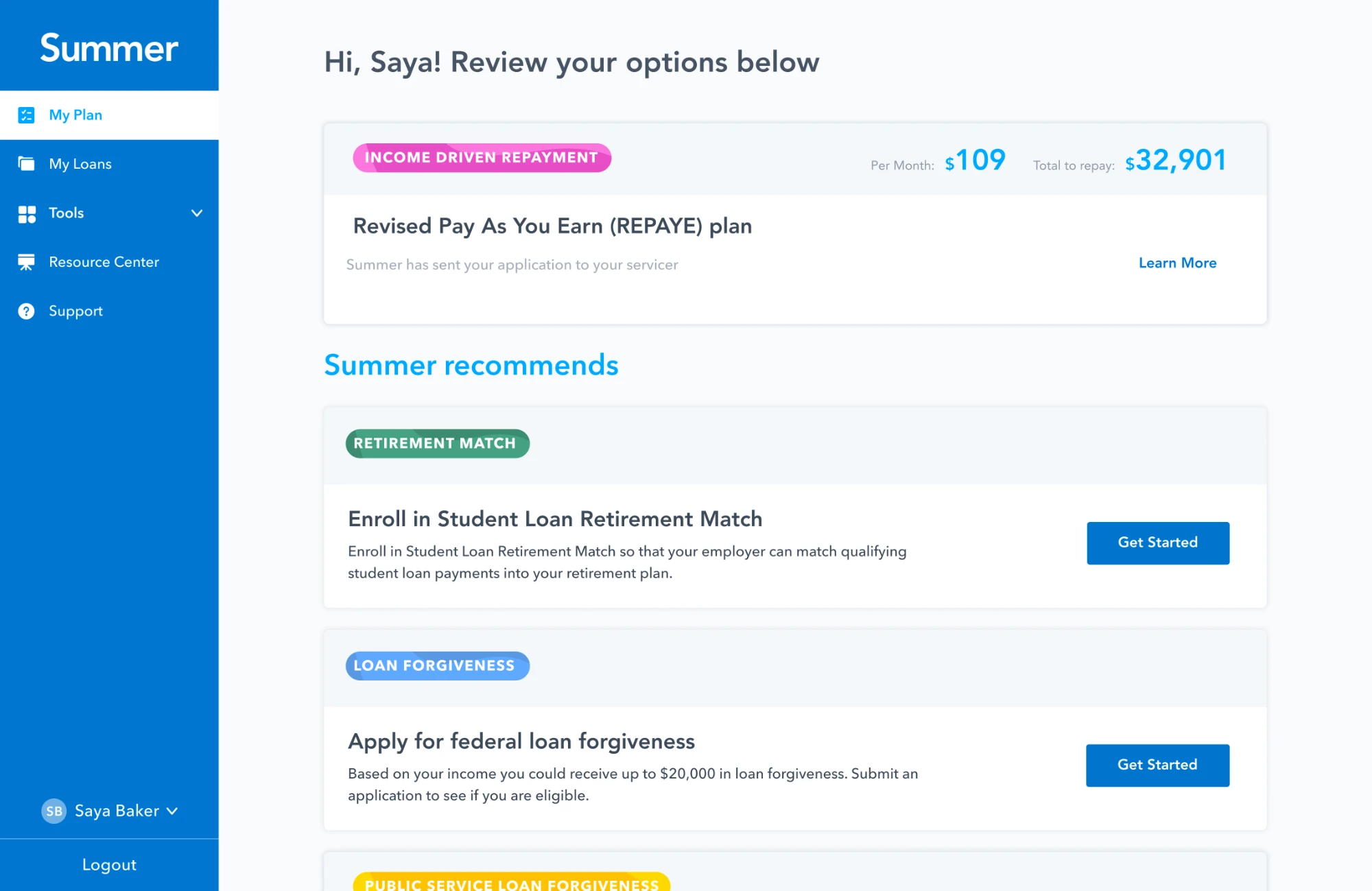 BeforeAfter
New York City
Summer's partnership with the City of New York put student-loan benefits in front of the city's workforce and residents, the largest municipal program of its kind. The contract carries an accessibility requirement, and Mosaic is how Summer meets it without re-auditing every screen.
A public-sector audience means a wide range of loan situations and people who did not choose the product: it only works if they finish enrolling. The flows that matter most to the city, from enrolment to the income-driven repayment and public-service forgiveness journeys, are prioritised in the migration because they propagate across products. I also designed the approver experience for the city's forgiveness programme, replacing repeated data entry and short-lived form links with a queue, prefilled forms and secure sessions, built on Mosaic from the start.
Results
Three product teams ship on the system. New features arrive accessible by default, the first complete journeys are fully migrated, and a conformance story that holds up in a contract now underpins Summer's pursuit of further state and government partnerships.
The accessibility evidence a government buyer asks for, conformance to WCAG 2.2 AA, a VPAT, an audit cadence, is now produced from one component layer rather than a special project per client. The next state contract names the standard explicitly, and the platform team is building automated testing and reporting so that evidence stays current. Mosaic is referenced as the daily design reference in team onboarding, and I own the rollout sequence for the remaining flows.